The settings described on this page are located in the ComfyUI in-app settings menu. You can open it by navigating to Settings (gear icon) or using the
Ctrl + , keyboard shortcut, then select the corresponding category to view and configure these options.Canvas
Show selection toolbox
- Default Value: Enabled
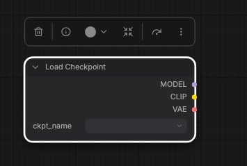
- Function: The selection toolbox is a floating quick action toolbar that appears on nodes after they are selected, providing common quick operations such as partial execution, pinning, deletion, color modification, etc.
Live selection
- Default Value: Enabled
- Function: When enabled, nodes are selected and deselected in real time while you drag a selection rectangle, similar to other design tools
Zoom node level of detail (font size threshold)
- Default Value: 8
- Range: 0 - 24
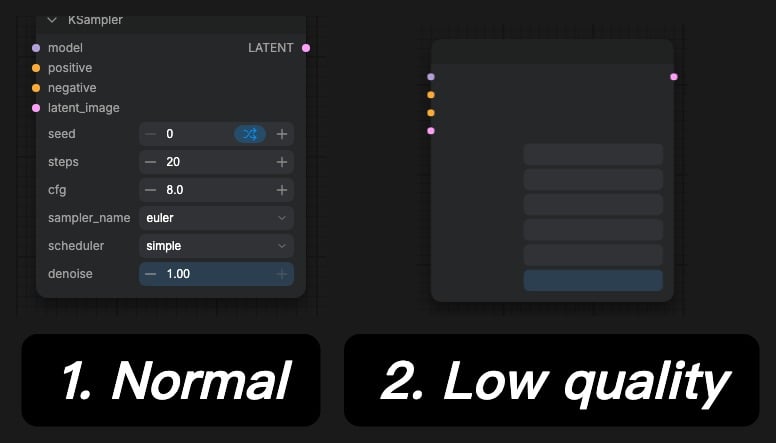
- Function: Sets when nodes switch to simplified level of detail rendering while you zoom out, measured as a minimum font size in pixels. Higher values switch nodes to simplified rendering sooner, lower values keep full node quality longer, and 0 disables level of detail switching entirely. The different rendering modes are shown below
Maximum FPS
- Default Value: 0 (use screen refresh rate)
- Range: 0 - 120
- Function: Limits the rendering frame rate of the canvas. 0 means using the screen refresh rate. Higher FPS will make the canvas rendering smoother, but will also consume more performance. Too low values will cause more obvious stuttering.
Always snap to grid
- Default Value: Disabled
- Function: When this option is not enabled, you can hold the
Shiftkey to align node edges with the grid. When enabled, node edges will automatically align with the grid without holding theShiftkey.
Snap to grid size
- Default Value: 10
- Range: 1 - 500
- Function: When auto-snap is enabled or when moving nodes while holding the
Shiftkey, this parameter determines the grid size for snapping. The default value is 10, and you can adjust it according to your needs.
Enable fast-zoom shortcut (Ctrl + Shift + Drag)
- Default Value: Enabled
- Function: Enables the
Ctrl + Shift + Left Mouse Button Dragfast zoom function, providing a faster zoom operation method
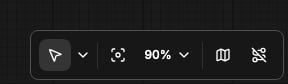
Show graph canvas menu
- Default Value: Enabled
- Function: Controls whether to display the canvas menu in the bottom right corner
Canvas zoom speed
- Default Value: 1.1
- Range: 1.01 - 2.5
- Function: Controls the speed of canvas zooming, adjusts the sensitivity of mouse wheel zooming
Show canvas info on bottom left corner (fps, etc.)
- Default Value: Enabled
- Function: Controls whether to display canvas information in the bottom left corner, showing performance metrics like FPS
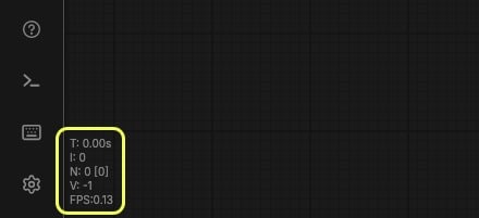
Auto-pan speed
- Default Value: 15
- Range: 0 - 30
- Function: Sets the maximum speed used when the canvas pans automatically as you drag a node or a link against the canvas edge. Set it to 0 to disable auto-panning
Canvas Navigation
Navigation Mode
- Default Value: Drag Navigation
- Options: Standard (New), Drag Navigation, Custom
- Function: Selects a preset for the two canvas navigation behaviors below. Standard (New) selects with the left mouse button and pans with the mouse wheel, Drag Navigation (the default) pans with the left mouse button and zooms with the mouse wheel, and Custom keeps whatever you set for each behavior individually. Changing either behavior away from its preset switches this setting to Custom
Left Mouse Click Behavior
- Default Value: Panning
- Options: Panning, Select
- Function: Sets what dragging with the left mouse button on an empty part of the canvas does: pan the canvas or draw a selection rectangle
Mouse Wheel Scroll
- Default Value: Zoom in/out
- Options: Panning, Zoom in/out
- Function: Sets what the mouse wheel does on the canvas: zoom in and out, or pan vertically
Context Menu
Scale node combo widget menus (lists) when zoomed in
- Default Value: Disabled
- Function: Controls whether to scale node combo widget menus (lists) when zoomed in, allowing users to select node combo widgets
Graph
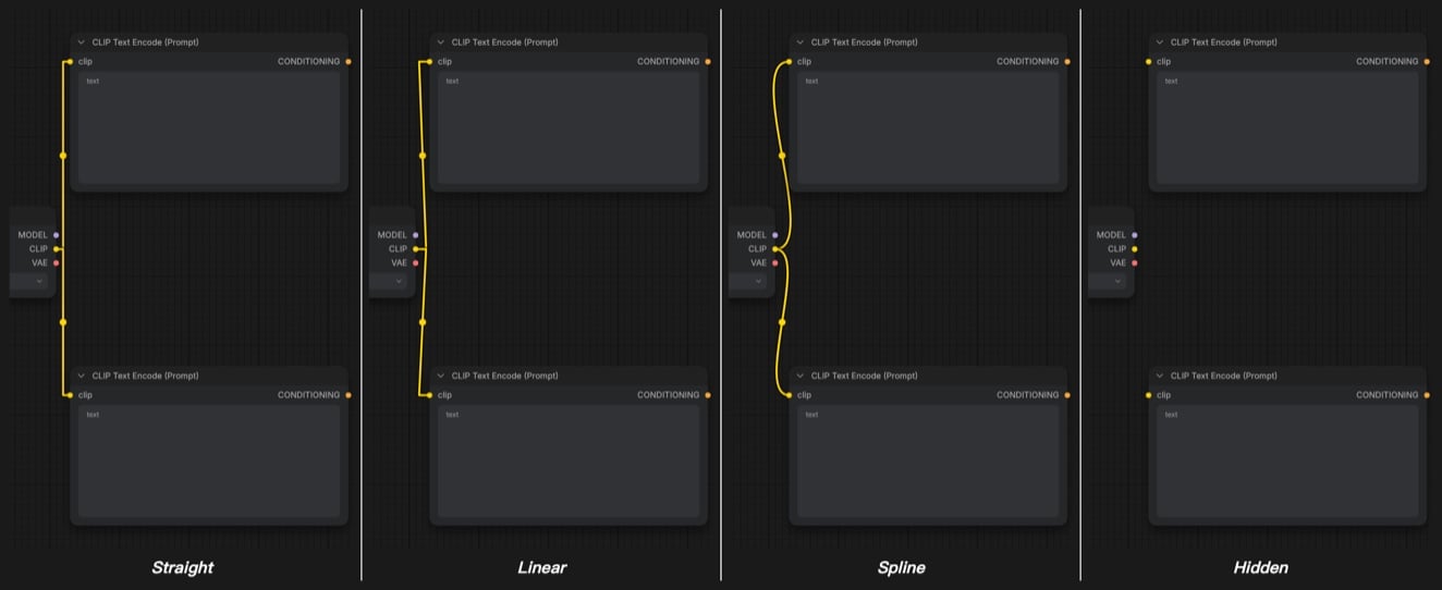
Link Render Mode
- Default Value: 2 (Spline)
- Options: Straight, Linear, Spline, Hidden
- Function: Sets the rendering style of connections, controlling the visual style of links between nodes
Group
This section of settings is mainly related to node group functionality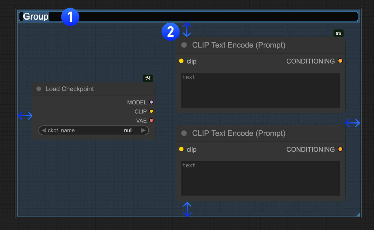
Double click group title to edit
- Default Value: Enabled
- Function: Controls whether you can double-click the node title to edit it, allowing users to rename nodes, marked as part
1in the image
Group selected nodes padding
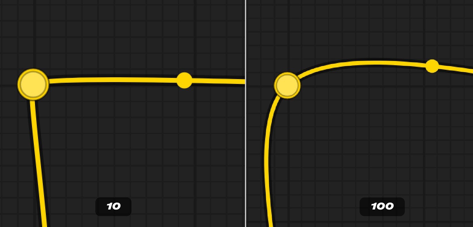
- Default Value: 10
- Range: 0 - 100
- Function: Sets the inner padding when grouping selected nodes, controlling the spacing between the group frame and nodes, marked as the arrow annotation part
2in the image
Select group children on click
- Default Value: Disabled
- Function: When enabled, clicking a group selects all nodes and items inside it
Link
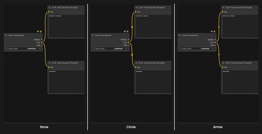
Link midpoint markers
- Default Value: Circle
- Options: None, Circle, Arrow
- Function: Sets the marker style at link midpoints, displaying direction indicators at link midpoints
Link Release
This menu section currently mainly controls related operations when link connections are released. The current two related operations are: A node recommendation list related to the current input/output will appear after release A search box will be launched after releaseAction on link release (Shift)
- Default Value: search box
- Options: context menu, search box, no action
- Function: Sets the action when releasing links while holding the Shift key, special behavior when releasing links while holding Shift
Action on link release (No modifier)
- Default Value: context menu
- Options: context menu, search box, no action
- Function: Sets the default action when releasing links, controls the behavior after dragging and releasing links
Node
Always shrink new nodes
- Default Value: Disabled
- Function: Controls whether to automatically shrink when creating new nodes, so nodes can always display the minimum size, but may cause some text display to be truncated when adding, requiring manual adjustment of node size
Enable DOM element clipping (enabling may reduce performance)
- Default Value: Enabled
- Function: Enables DOM element clipping (may affect performance), optimizes rendering but may reduce performance
Middle-click creates a new Reroute node
- Default Value: Enabled
- Function: Creates a new reroute node when middle-clicking, quickly creates reroute nodes for organizing connections
Keep all links when deleting nodes
- Default Value: Enabled
- Function: Automatically bypasses connections when deleting intermediate nodes, attempts to reconnect input and output links when deleting nodes
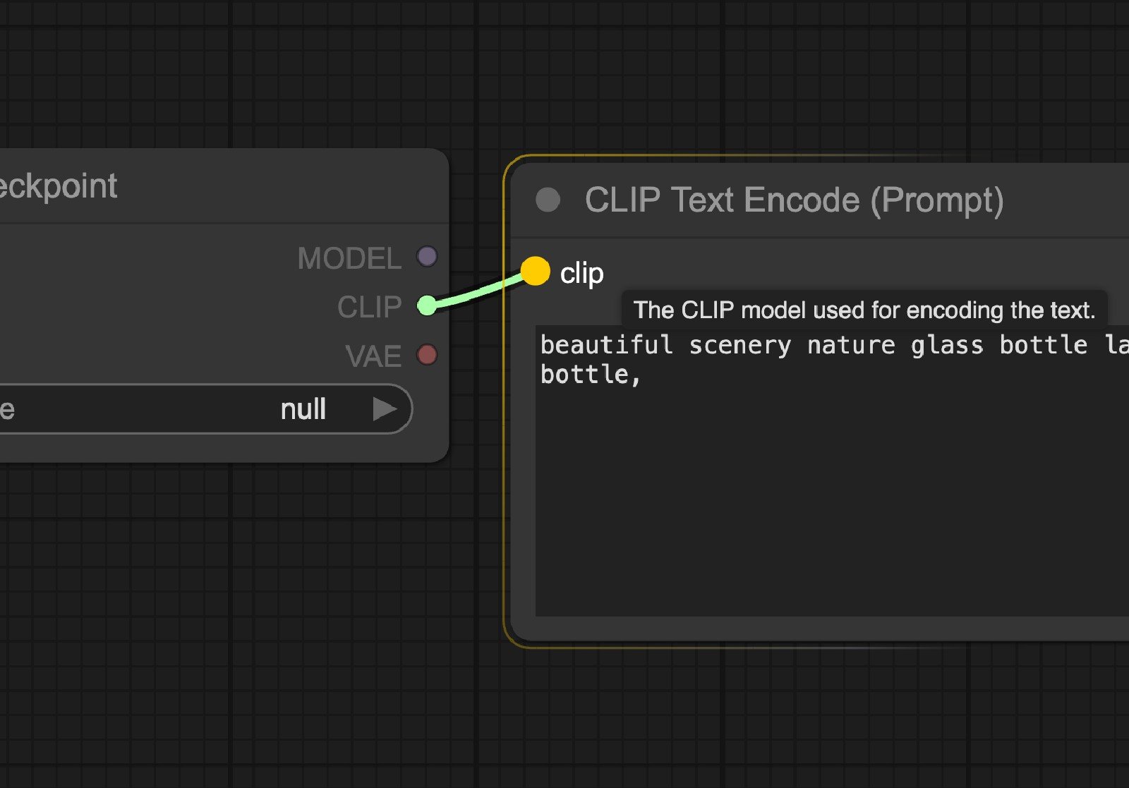
Snap highlights node
- Default Value: Enabled
- Function: Highlights nodes when dragging links to them, provides visual feedback, shows connectable nodes. When enabled, the effect is as shown in the image below, the corresponding side of the link will display highlighted style
Auto snap link to node slot
- Default Value: Enabled
- Function: Automatically snaps to available slots when dragging links to nodes, simplifies connection operations, automatically finds suitable input slots
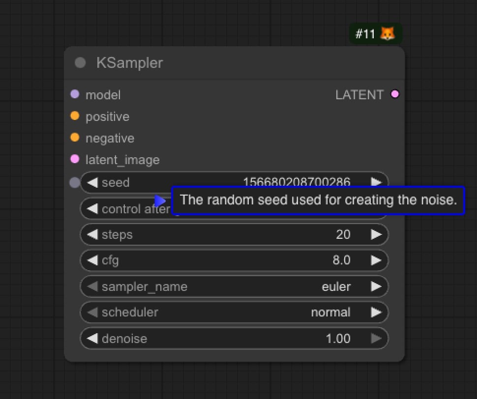
Enable Tooltips
- Default Value: Enabled
- Function: Some node information will contain tooltips, including parameter descriptions, etc. When enabled, these tooltips will be displayed when hovering the mouse, as shown in the image below
Tooltip Delay
- Default Value: 500
- Range: 100 - 3000
- Function: Controls the delay before a tooltip appears, in milliseconds
Node life cycle badge mode
- Default Value: Show all
- Function: Controls the display of node lifecycle markers, showing node status information
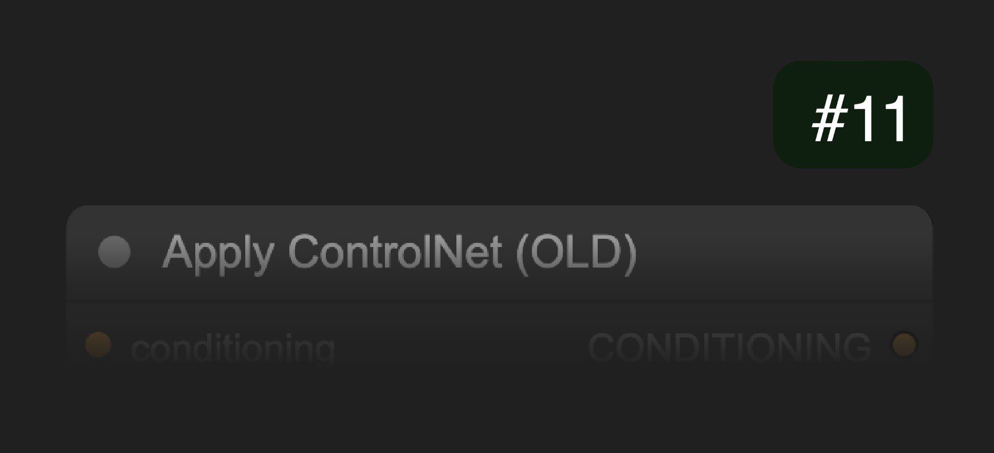
Node ID badge mode
- Default Value: None
- Function: Controls the display of node ID markers, showing node unique identifiers
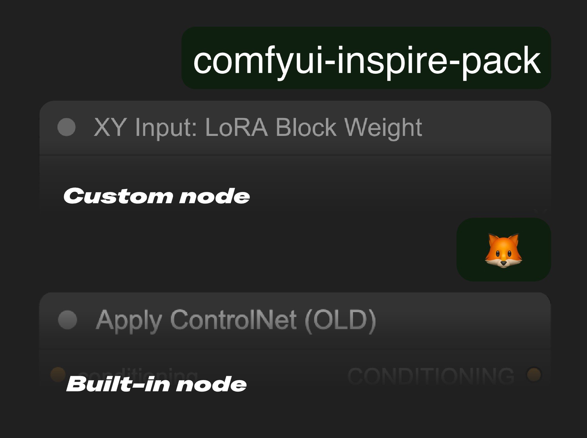
Node source badge mode
- Default Value: Hide built-in
- Options:
- None
- Hide built-in
- Show all
- Function: Controls the display mode of node source markers, showing node source information. The corresponding display effect is shown in the image below. If show all is selected, it will display labels for both custom nodes and built-in nodes, making it convenient for you to determine the corresponding node source. The corresponding fox logo represents ComfyUI built-in nodes
Double click node title to edit
- Default Value: Enabled
- Function: Controls whether you can double-click the node title to edit it, allowing users to rename nodes
Node Widget
Float widget rounding decimal places [0 = auto]
- Default Value: 0 (auto)
- Range: 0 - 6
- Function: Sets the decimal places for float widget rounding, 0 means auto, requires page reload
Disable default float widget rounding
- Default Value: Disabled
- Function: Controls whether to disable default float widget rounding, requires page reload, cannot be disabled when the node backend has set rounding
Disable node widget sliders
- Default Value: Disabled
- Function: Controls whether to disable slider controls in node widgets, forcing text input instead of sliders
Always show advanced widgets on all nodes
- Default Value: Disabled
- Function: When enabled, advanced widgets are always visible on all nodes without expanding each node individually
Preview image format
- Default Value: Empty string (use original format)
- Function: Sets the format for preview images in image widgets, converts to lightweight formats like webp, jpeg, etc.
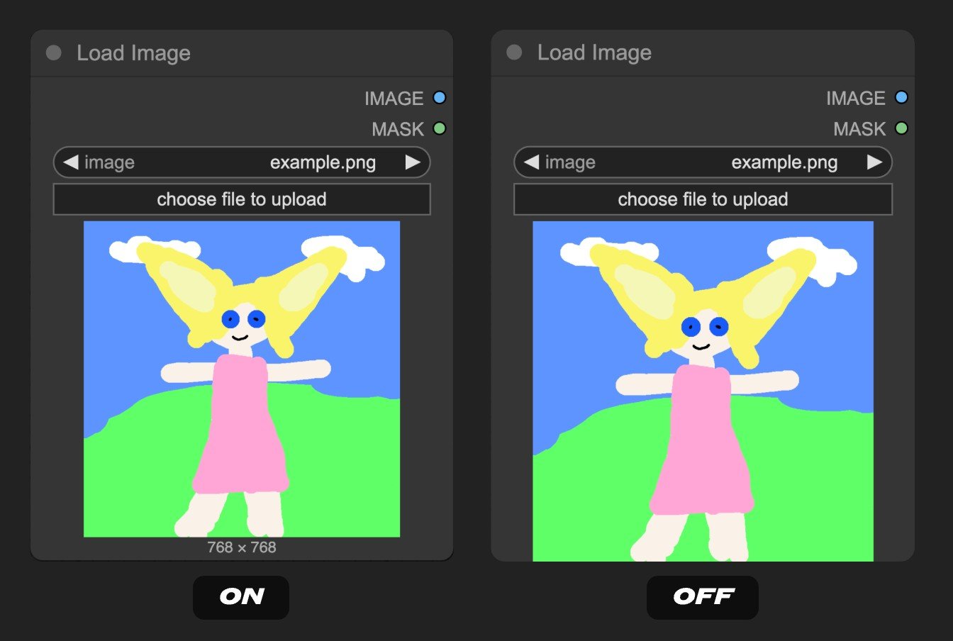
Show width × height below the image preview
- Default Value: Enabled
- Function: Displays width × height information below image previews, showing image dimension information
Pointer
Enable trackpad gestures
- Default Value: Enabled
- Function: This setting enables trackpad mode for the canvas, allowing two-finger pinch zoom and drag.
Double click interval (maximum)
- Default Value: 300
- Function: Maximum time (milliseconds) between two clicks of a double-click. Increasing this value helps solve issues where double-clicks are sometimes not recognized.
Pointer click drift (maximum distance)
- Default Value: 6
- Function: If the pointer moves more than this distance while holding the button, it is considered a drag (rather than a click). Helps prevent accidental mouse movement when clicking.
Reroute
Reroute spline offset
- Default Value: 20
- Function: Used to determine the smoothness of curves on both sides of reroute nodes. Larger values make curves smoother, smaller values make curves sharper.